If you’ve taken part in building a website since the iPhone, you’ve probably heard the term “responsive design” — the idea that your website responds to the device in use by stacking, shifting, or resizing to best serve the content. What you may not think about though is responsive logo design — how your brand’s logo adapts as that process occurs.
What is a Responsive Logo Design?
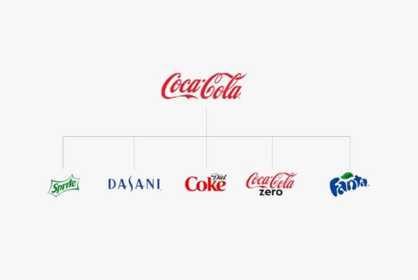
With logos applying to so many digital touch points (websites, products, apps, social media, etc.) the need for responsive logo design allows for flexibility in application while maintaining the most important idea of brand identity: consistency. The goal is to create a logo that has distinct elements that can scale as devices scale. Your logo on a desktop experience would have the full logo while your Facebook profile image or your website on a mobile device would use a simplified version of the full logo. Here’s some examples:
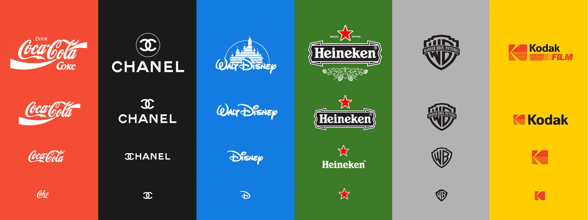
Image Source: https://www.pinterest.com/pin/566257353142511553/
Guidance for a Successful Responsive Logo
- As the space or format gets smaller, the detail or elements in the logo become simplified. For example, the name of your company is always right next to the profile image in Facebook, so you can use an icon or simplified version of the logo instead of the full lockup.
- Stick to 3 – 4 versions of the logo. If you do too many, you will likely lose recognition with your audience.
- Keep the unique elements/style of the full logo present at all times as you scale down.
The days of one logo for everything are over. We recommend every brand consider how their logo responds to the various brand touch points. Responsive logos are a great tool to ensure a flexible yet consistent identity no matter the application.
Need a responsive logo?
Get Started